ATLAS OSAOS
Building the future. Creating lasting spaces.
ATLAS OS is the building-operations platform for self-sufficient ATLAS habitats — one floor per human need, rendered as an interactive 3D digital twin with live telemetry, incident triage, and resident broadcast.


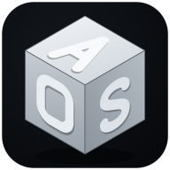
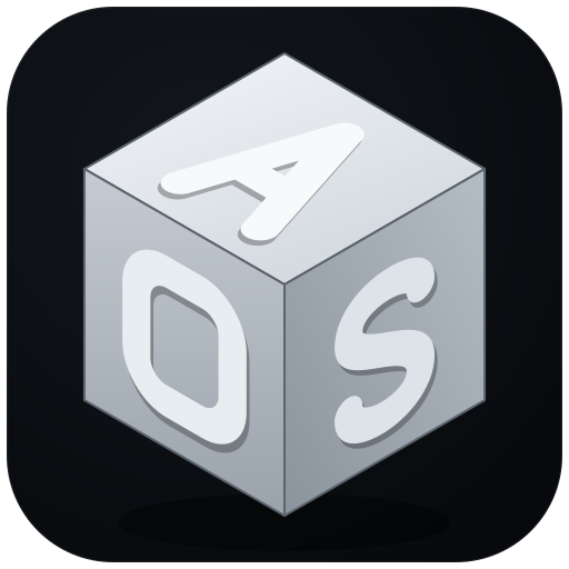
Logo & mark
An isometric, brushed-metal cube. Its three lit faces carry the letters A · O · S — one habitat, many faces, a single system.
Clear space & don'ts: keep clear space equal to the cube's top face around the mark. Never stretch, rotate, or recolor the AOS cube, and never place dark text on Ink surfaces.
Color
Ink — surfaces
Dark, layered console surfaces. Ink-950 is the page; lighter steps lift panels and borders.
Signal — status
Operational status. Reserved for state — never decoration — so a color always means something.
Need — floor accents
One accent per human need. Color-codes floors across the twin, KPI strip, and fleet rollup.
Typography
Voice & tone
We run mission-critical systems. The interface stays quiet so the signal is loud — status is shown, never shouted.
Numbers are exact and monospaced; language is plain and human. We name things the way an operator would.
Glassy surfaces, soft motion, a twin that breathes. The product should feel like a place, not a dashboard.
- Lead with the metric, then the context.
- Use Signal colors only to mean state.
- Keep one accent per need — never recolor a floor.
- Italic gradient emphasis for the line that matters most.
- Don't use red for anything but critical.
- Don't stack more than one emphasis style per view.
- Don't place dark text on Ink surfaces.
- Don't stretch or recolor the AOS cube.
Everything on this page is exported in the kit — tokens, logos, and guidelines.
Download brand kit (.zip)